अभी के Time में लोग ज्यादा तर Mobile से ही Internet Use करना पसंद करते हैं। पहले जो Futures को Desktop पर देता था अभी उनमे से लगभग futures को Mobile में भी देता है। इसीलिए आपका Blog Mobile Friendly होना बहुत ही Important है। तो चलिए आज में आपको इस Post के जरिये बताने जा रहा हूँ की “Blogspot Blog को पूरी तरह से Mobile Friendly कैसे बनाये”

अभी Blogging आसानी से Mobile से भी किया जा सकता है। अगर आप Blogspot User हो तो हो सकता है आपको Desktop की जरुरत पड़े।
एक Time ऐसा भी था की लोग Mobile को बहुत ही कम इस्तेमाल करते थे और Desktop को ज्यादा But अभी उसका Just Opposite हो गया है। एक Research के मुताबिक बताया गया है की अभी Present Time में 70% लोग Internet Mobile से ही Use करते हैं. और दोस्तों लोग ऐसा करे भी क्यों नहीं क्योकि जितना Functions अभी Desktop पर दिया हुआ है उसका लगभग Functions को Mobile में भी उपलब्ध करवाया गया है।
अभी Google ने कुछ दिन पहले ये Announcement किया है की Mobile Friendly First Index यानि Mobile Friendly Blog या Website को Google Search Result में पहले Show करवाएगा। तो इससे ये साफ़ साफ पता चलता है की आपका Site Mobile Friendly होना कितना Important है।
Blogspot Blog को पूरी तरह से Mobile Friendly कैसे बनाये
अब में आपको कुछ Step बता रहा हूँ. जिन्हें आप follow करके अपने Blog को पूरी तरह से Mobile Friendly बना सकते हो।
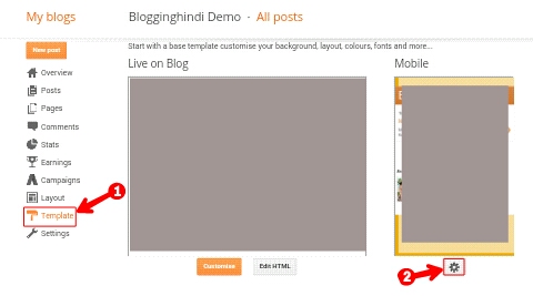
Step 1: सबसे पहले तो आप Blogger में Login करें फिर Blog के Dashboard में जाइये।
- अब Template पर Click करें
- अब इस Icon पर Click करें
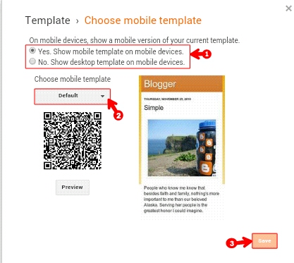
- अब ‘Yes. Show mobile template on mobile devices’ को Select करें
- यहाँ Template select करें।
- अब Save कर दीजिए।
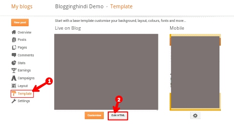
Step 2: अब फिर Blog Dashboard में जाइये।
- अब Template पर Click करें
- अब Edit HTML पर Click करें
Step 3: अब <head> को Search करें. अब <head> के निचे निचे दिया हुआ Code Past कर दीजिए और Template Save कर देना।
 <meta name='viewport'

content='width=device-width,initial-

scale=1.0,minimum-scale=1.0,maximum-

scale=1.0'/>
Step 4: अब निचे दिए हुए code को Copy कर लीजिए।
/* Laptops and Desktops */

@media only screen and (max-width :

1280px) {

/* The following css will be rendered if

device width is less than 1280px */

}

/* Tablets (Landscape) */

@media only screen and (max-width :

1024px) {

/* The following css will be rendered if

device width is less than 1024px */

}

/* Tablets (Portrait) */

@media only screen and (max-width :

768px) {

/* The following css will be rendered if

device width is less than 768px */

}

/* iPhones */

@media only screen and (max-width :

640px) {

/* The following css will be rendered if

device width is less than 640xpx */

}

/* Mobiles */

@media only screen and (max-width :

480px) {

/* The following css will be rendered if

device width is less than 480px */

}

/* Small Mobiles */

@media only screen and (max-width :

320px) {

/* The following css will be rendered if

device width is less than 320px */

}
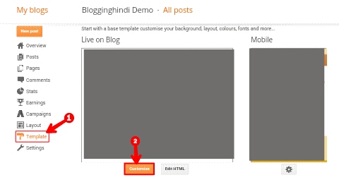
Step 5: अब फिर Blog के Dashboard में जाइये।
- Template पर Click कीजिए
- Customize बटन पर Click कीजिए
Step 6:
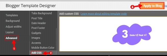
- Advanced पर Click करें
- अब Add CSS पर Click करें।
- यहाँ Copy किये हुआ Code को Past कर दीजिए।
- अब Apply to Blog पर Click करें।
.
.
.
.
.
में आशा करता हूँ की आपको ये Post अच्छा लगा होगा. अगर आपके मन में इससे Related कोई सवाल है तो आप हमें Comment में बता सकते हो। में आपसे यही कहूँगा की Post को ज्यादा से ज्यादा Social Media में Share करें।
wow nice infromation. thanks Arshad for sharing this amazing information.
This information is very useful for me.
Thank you for your information sir.
Thank you very much.